The Ultimate Guide to Voice Over and Dubbing
June 16, 2022
Voice Over vs Voice Acting – Which Should I choose?
August 22, 2022According to Blogging Wizard, in 2021, a video was the most commonly used marketing strategy, followed by blogs and infographics. Blogging Wizard also shares another crucial statistic that might have influenced the trend of the majority of brands turning to video marketing. In 2020, people watched over 12.2 billion minutes of video.
According to HubSpot, that’s around 23,211 years’ worth of content consumed within a year.
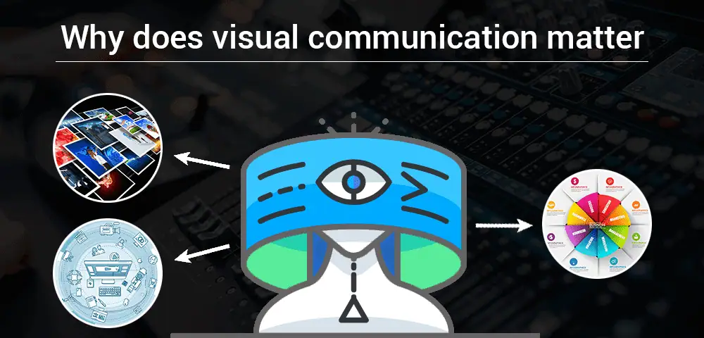
These statistics shed light on how visual content and communication have evolved in recent years. So, let’s take a deep dive into the visual world to understand why visual communication is important.
Contents
A] Introduction to Visual Communication
What is visual communication? This is a commonly asked question, and to explain it in brief visual communication is exactly what it seems – a way to communicate via visual elements such as graphics.
- Visual elements can add more value to the words, evoking more emotions from the listener or reader.
- Visual communication helps you get the message across clearly and concisely.
- It can also help avoid confusion experienced when people communicate without a visual reference.
This kind of content is geared toward visual learners, where a person needs to see the information in order to process it. Visual elements help them interpret information effectively. While visual learners might benefit a lot from visual content, others also benefit from it. Consider the growing popularity of social media platforms such as YouTube, Instagram, TikTok, and Facebook.
Unless people are trying to find a tutorial or answers to something, they don’t bother reading long-form content unless it is incorporated with visual elements. Adding visual content to your copy will help you better connect with your audience. According to a 2020 survey, around 48% of content marketers said that 91 to 100% of their content was composed of visual elements.
B] Types of Visual Communication
-
- Eye-Catching Infographics
Infographic Reference: BusinessInsider
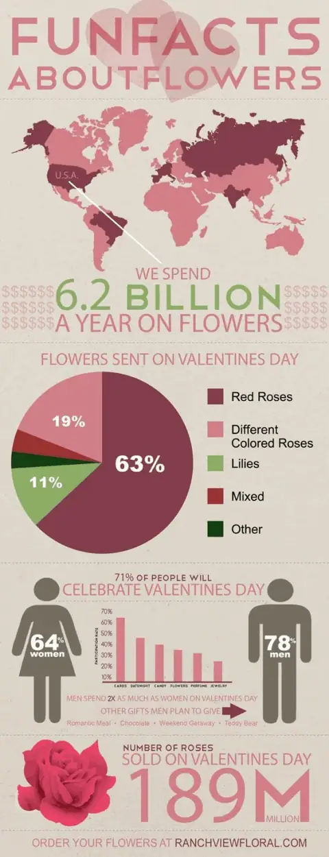
With an infographic, you can put together words and graphics to create an easy-to-understand content format. It also reduces the reading time, helping the reader better understand the points that otherwise are lost in verbose content.
The above example shows the statistics of Flowers sold and revenue earned on Valentine’s Day. The colour scheme of the infographic remains true to the valentine’s day theme. The graphics in these elements, including the stunning rose and male and female figures, have been smartly positioned. Furthermore, it also includes a pie chart to show the percentage of flowers sent on valentine’s day.
-
- Engaging Videos
While a detailed infographic is good for displaying data and statistics, it isn’t as engaging as video content. Video content, especially explainer video, is better suited for product launches and virtual events. It is also better for conversion. Furthermore, with video content, you can capture and share experiences that could never be fully put into words.
Most businesses also make use of voice over services to make the video more appealing. By adding a voice over to your video, you’d be able to better connect with the users. A voice over artist can also make the video more engaging, thereby improving your chances for higher conversion.
To learn more about how videos can help, take a look at this beautiful time-lapse video of a plant growing.
Consider how difficult it would be to explain or describe how the process occurs. Even with a detailed description, the beauty of watching it grow gracefully is next to impossible. Watching a seed take root and grow out is a unique experience that might have been impossible without the help of technology.
Video Reference: GPhase
-
- Relevant Images or GIFs
GIF URL: GIPHY.com
Let’s talk about how adding relevant images and GIFs can improve the value of your content.
For instance, consider this visual communication guide. By adding relevant visual elements such as videos, Gifs, and infographics, we have ensured that the reader will understand the value of visual communication.
In addition, it has been observed that content containing images/videos perform way better. Ads with image content such as infographics also have a higher click-through rate. Thanks to technology and generous artists, it is easy to find royalty-free images and GIFs online. You can use it to enrich your website with engaging visual elements.
Dan Zarrella, a social media expert, experimented with a dataset of over 400,000 tweets. He observed that tweets with images are 94% more likely to be Retweeted.
C] Recognising the Challenges Visual Communication Overcomes
Some content creators have also faced the issue of putting hours of research into the content, and yet coming up empty. Their content fails to engage readers. To fix these issues, they have to accurately identify the challenges they are facing with their visual communication strategy.
1. Competing with other Technological distractions
It is a common misconception that human attention is shortening over the decades, falling to 8.25 from 12 between 2000-2015. The alleged human attention span of 8.25 is considered lower than that of a goldfish. Such statistics have been shared by several reputed websites, but it is a myth. Find out why it isn’t true in BBC’s eye-opening piece on the topic by Simon Maybin..
According to Dr Gemma Briggs, a person’s attention span is dependent on the task they are performing. It depends on how much attention the task demands. Although the BBC post has long busted the myth, it does shed some light on how technology offers myriads of distractions and how it has changed the way readers consume content.
There are high chances that people going through your content are also using other devices simultaneously. In such cases, it becomes a competition of which device holds the person’s attention. Typically, the device with the most engaging content would win.
In order to overcome this challenge, the content creator has to incorporate appropriate visual elements in their content. Suppose they are working on a Step-by-Step guide. They can create an infographic to summarise these steps or hire a voice over artist to create a video for the same.
2. Creating Memorable And Engaging Content
It is quite obvious that one has to create content that will stay with the reader long before they have moved on from it. It should light a spark that stays lit forever or at least long enough for them to share it with other people.
One of the main aspects of creating memorable content is engaging your audience with a story that speaks to them. Also, while stories, on their own, are a great way to increase engagement, adding visual elements to these stories boosts the appeal of the content.
If your content fails to make an impression on your audience, consider re-evaluating it.
-
-
- Does the video sound robotic?
- Does it require a new tone?
-
Once you have re-evaluated the content, you can add relevant visual elements to go with it.
D] How to incorporate Visual Communication into your Content?
1. Use creative and smart graphics in your visual elements
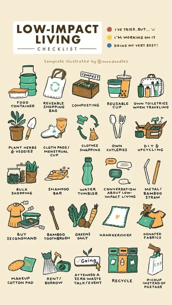
Consider this low-impact living checklist from Pinterest. The creator has used their expertise in illustration to create this eco-friendly, impactful, and engaging infographic that one can quickly share on different social media channels. People can use it as an Instagram story template and tag each other. Creating such a creative and relevant infographic will spread awareness about your brand.
2. Use Stylized Icons and fonts in your visuals to bring it to life
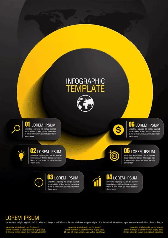
Shared below is a striking infographic template from a free pic. It can be easily used for creating different types of infographics. But it is most ideal for creating an infographic for technical information. The stylized icons and fonts will hold the viewer’s attention long enough to get your point across.
3. Consider the Significance of Colours and use them sparingly
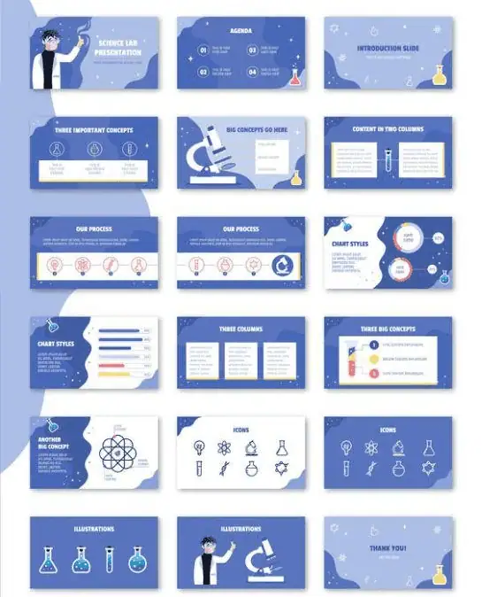
According to London Image Institute, the colour blue signifies loyalty, trust, peace, integrity, and serenity. The majority of branding agencies use the colour blue with white to create an inviting picture for their visitors. They stick to the pastel shades to create a user-friendly experience. Making sure that your website’s primary colours are seen throughout the system improves the user experience, and visitors are more attentive to the content. Also, keep in mind that colours should be used sparsely.
Here’s an example of Science Lab illustrated presentation templates from Behance
Conclusion
We have covered all of the important aspects of visual communication. In our journey, we have discovered that visual elements ranging from infographics to presentations each have a role to play. Likewise, videos, one of the most sought-after visual elements, become more engaging with music or a voice over.
FAQs
What is visual communication, and why is it important?
Visual communication is the practice of conveying ideas and information through images, graphics, videos, and other visual elements. It’s important because visuals can simplify complex concepts, grab attention, and help audiences understand and remember information more effectively.
How can visual communication improve learning and understanding?
Using charts, diagrams, and videos can make learning faster and information easier to retain. Visual communication helps people process information more efficiently, which is why it’s widely used in education, training, and presentations.
What are the common types of visual communication?
Common types of visual communication include infographics, presentations, charts, videos, illustrations, and digital graphics. Each type serves a purpose, whether explaining data, telling a story, or supporting written content.
How does visual communication benefit businesses and marketing?
Businesses use visual communication to convey their brand message clearly, engage their audience, and make content more memorable. Well-designed visuals can increase audience interest, improve understanding, and strengthen brand recognition.
What makes visual communication effective and engaging?
Effective visual communication is clear, well-organised, and visually appealing. It combines the right balance of colour, design, and content to guide the audience’s attention and make messages easy to understand.

Peter Abraham
Peter Abraham is a versatile voice-over artist based in Mumbai working in the voiceover industry since 2009. With a passion for storytelling and meticulous attention to detail in every project, he brings scripts to life with his captivating voice and professional delivery, exceeding client expectations. Whether it's a commercial or an audiobook, Peter specializes in a wide range of voice-over work, ensuring the highest quality.

